ShopDreamUp AI ArtDreamUp
Deviation Actions


Suggested Deviants


Suggested Collections


You Might Like…


Description
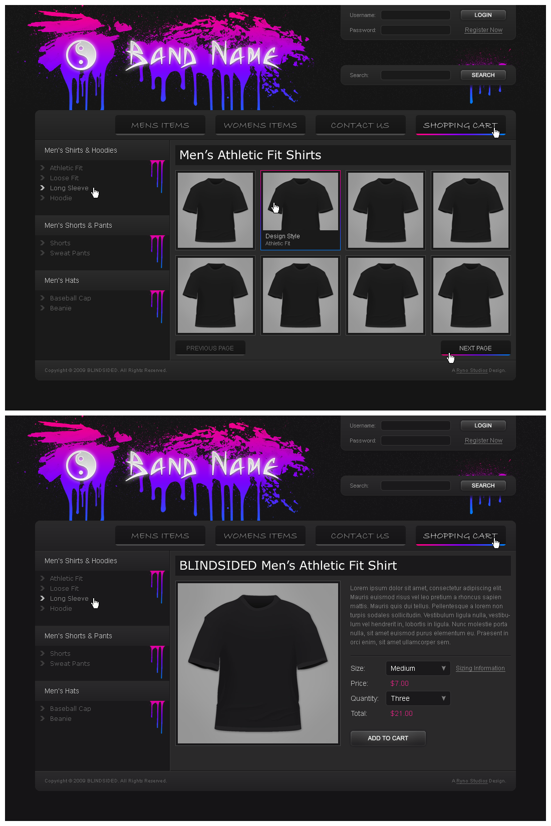
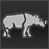
An acquaintance recently informed me that he wanted a website to sell his band's merchandise through. In the end we decided going through CafePress would be much easier for him to manage.
Nonetheless, it inspired me to create a simple design that could be used to list and sell band merchandise. I knew from the start that I wanted a design that would work well for only a smaller inventory, like less than 50 items total. That is why this design would likely be the same width and height on all pages.
When I started designing this, I was just doing it in gray-scale, as my friend's band's merchandise only came in black with the logo printed in white. It wasn't until the layout was fully completed that I decided to add the color and spray paint effects.
I really like the concept with the spray paint and drips, but perhaps my execution could be better. I know this motif has been done to death with band stuff, but it works well.
This design is for sale; contact me for more information
Image size
1100x1650px 537.3 KB
© 2009 - 2024 rthaut
Comments2
Join the community to add your comment. Already a deviant? Log In
The color certainly does accent it, and I agree with you regarding the splatters. Love the logo, too.  (Smile)")
One thing that bothers me slightly is the top four buttons. They come off as a bit too dark overall, especially with the grey text. Maybe white would've worked better to draw attention?
One thing that bothers me slightly is the top four buttons. They come off as a bit too dark overall, especially with the grey text. Maybe white would've worked better to draw attention?